Discussion Board Redesign
Problem Proposal
Definition and Related Work
Design Alternatives
1. Group Work
User Story
User Type: Student
As a student, I would like to collaborate with my classmates in real time using rich markup tools so that I can effectively complete due assignments in a collaborative environment.
Relevance to Project
In today’s digital equipped world, students would like to easily collaborate with one another using rich real time collaborative tools. Tools like Google Drive and the associated tools allow for simple, effective collaboration.
Ideation
| Group Work | |||
| Live Edit - Rich Text Editor - ie. Google Doc / Word Online | Group Chat Interface (Messages / Voice / Real-Time Updates) - ie. Discord or Slack | Threaded Forum Interface with Live Real Time Updates - ie. Piazza | Hybrid among all the other interfaces - ie. Microsoft Teams |
Low-Fidelity Wireframe
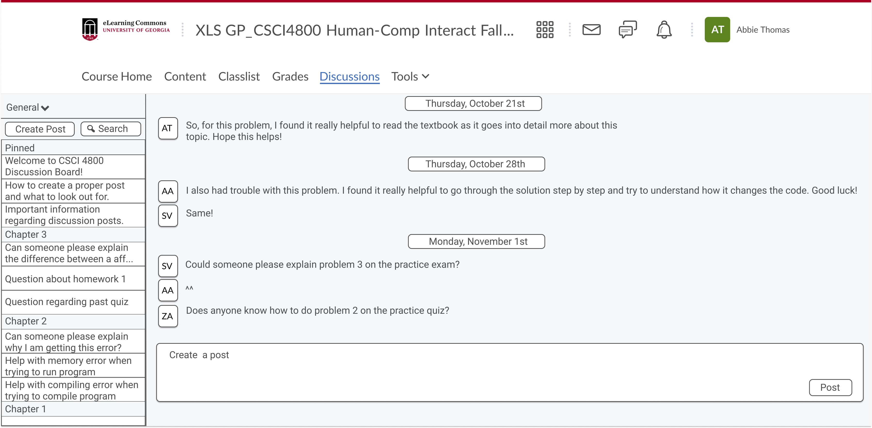
Group chat function: Live chat discussion feature so students can discuss class material in live time during the lecture. Students can chat to work on group work/projects or to share their perspectives about the class material.
Why is this the best design? / Why were design choices made?
- Having a live chat feed would facilitate in-class discussions between students. This would help with group work because students can easily work with their peers in live time and send messages back and forth.
- Students would not have to move around the classroom to collaborate, which can be disruptive - they can just chat with their peers wherever they are seated and communicate via live chat.
- We felt like a simple interface where students can see who sends a message would be the best design because then, students can easily identify who sent the message.
- We considered a few different options for students to communicate in live time during class, such as a virtual sticky note board or just having students move by one another and then collaborate. We felt like a live chat design was the best and optimizes how students work together and give every student voice to contribute. (Leah, 2019)
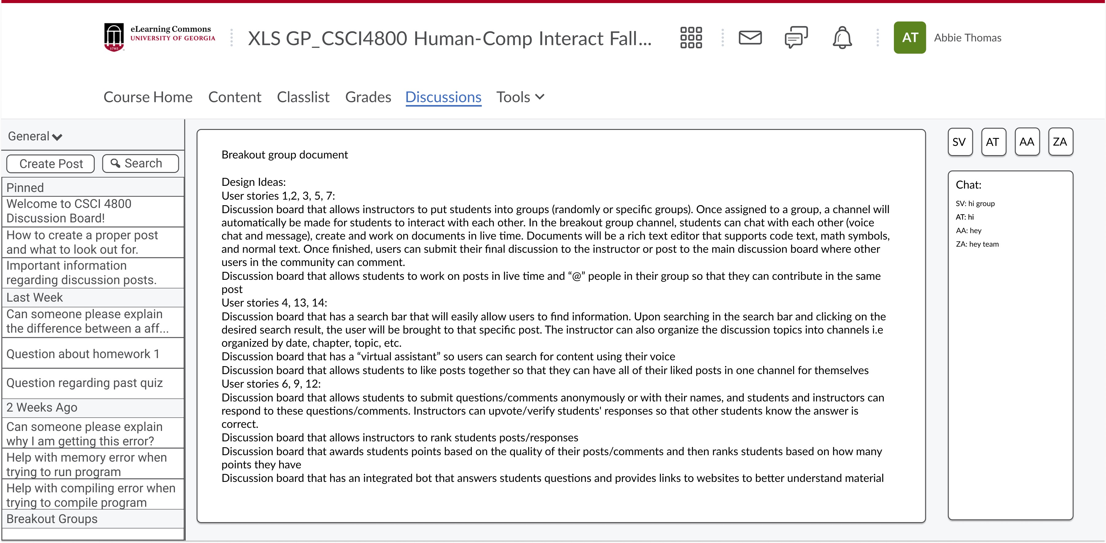
Live text editor: Online rich text editor that allows users to collaborate in real-time and features a side chat bar for collaborators to communicate. The documents will be a rich text editor that supports code syntax, math symbols, and normal text.
Why is this the best design? / Why were design choices made?
- When collaborating on a group document, each team member needs to have up-to-date information. Real-time editing documents are critical for optimizing workflow. Live text editors reduce duplicate work, improve communication between team members, and improve collaboration overall. (Why Modern..., 2021)
- Design-wise, we decided to go with a simple interface that is very intuitive for users to use. The text editor is in the center of the page so users can focus on working on their document and then a chat bar on the right side so users can send instant messages to each other while working. The document is a rich text editor and supports code syntax, math symbols, and regular text. We designed this discussion chat feature like a messaging tool that is very intuitive for users. The design is similar to a texting application where users type their message in the designated chat field and then hit send. (Attfield, 2021)
- Other designs were considered, such as moving the chat bar below the text editor, but this would decrease the size of the text editor, and users would have to scroll more to view their document. We felt like this would interfere with users' workflow and decrease productivity, which is why we decided to design the user interface with the text editor document in the middle and the chat bar to the right of it.
Group chat function
Live text editor
High-Fidelity Mockup
i. Click "Respond"
ii. Click + to add members (twice for this example)
iii. Click "Respond" to make group or "Cancel" to cancel
iv. Click the message icon to view messages
v. Click the send button to see a sample message
vi. Click "Back" to return to forum page
2.Class Discussion
User Story
User Type: Student
As a student, I would like to contribute to the class discussion to participate, add to the discussion, and / or voice my stance on a subject matter.
Relevance to Project:
Students in a classroom and online setting would like to be able to contribute their ideas to a class discussion, class topics, and voice their stance on a particular subject.
Ideation
| Class Discussion | |||
| Threaded allowing everyone to contribute in a forum | Massive Live Document - allowing each student / group their own work space to add to the discussion | Raise your hand in class and wait for the chance (or not), to speak and voice your stance on a class discussion | Interface like a dump bucket where all students can drop in and the most common ideas get larger and larger among them all |
Low-Fidelity Wireframe
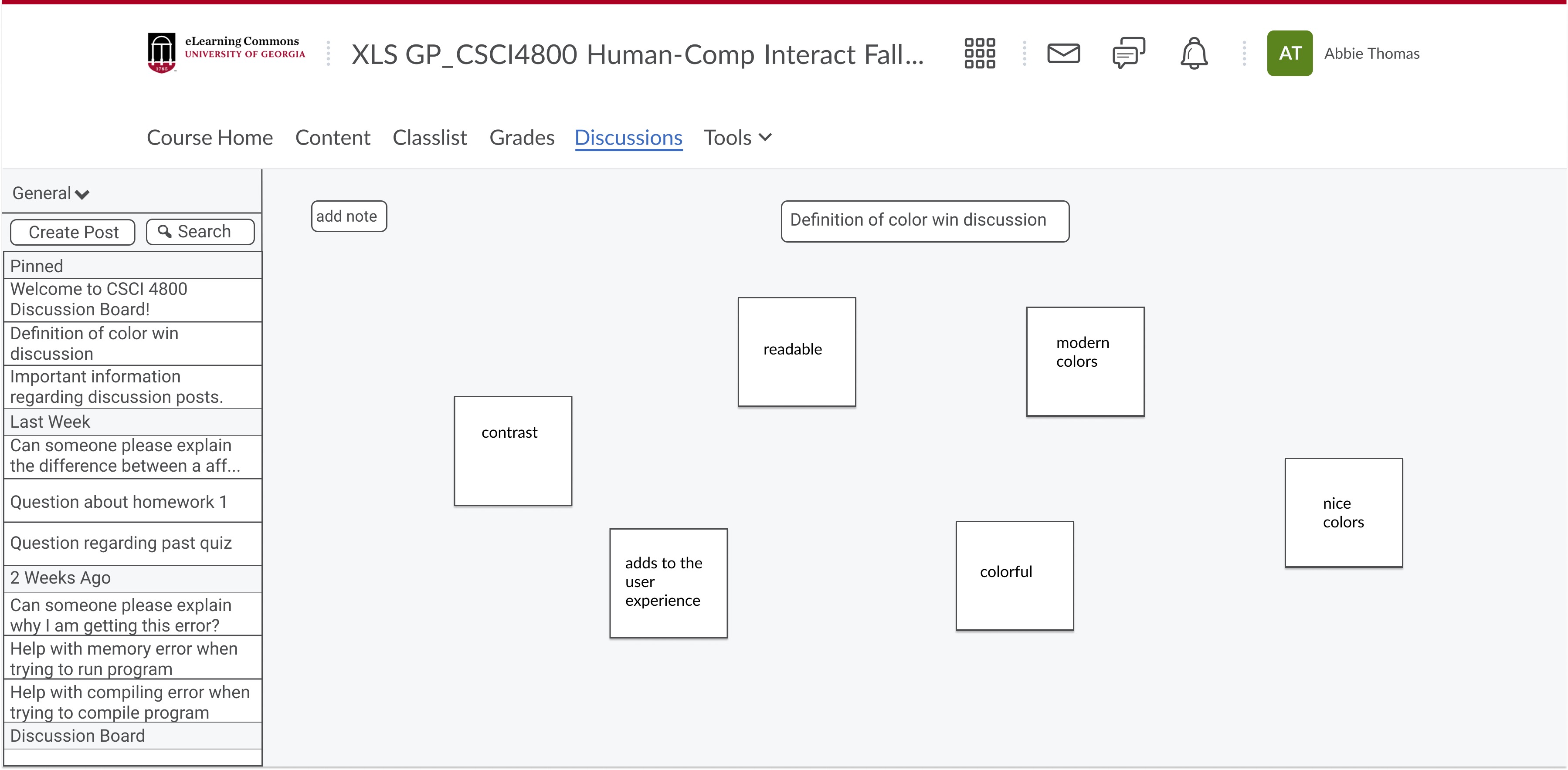
Dump Bucket Layout: A sticky note / dump bucket discussion board that allows students to write on an online sticky note and add it to the discussion board so that they can easily brainstorm and share their ideas in a more creative discussion forum.
Why is this the best design / why design decisions were made?
- Design-wise, a sticky note discussion forum would allow students to remain anonymous, thus promoting an inviting environment where students feel free to post their ideas without fear of being judged by their peers. Sticky note design also provides a visual way to discuss ideas. We considered other design ideas for the sticky note design, such as including author names on the sticky note but we felt like one benefit of sticky note discussion boards is that users retain some anonymity. (Sticky note..., 2021)
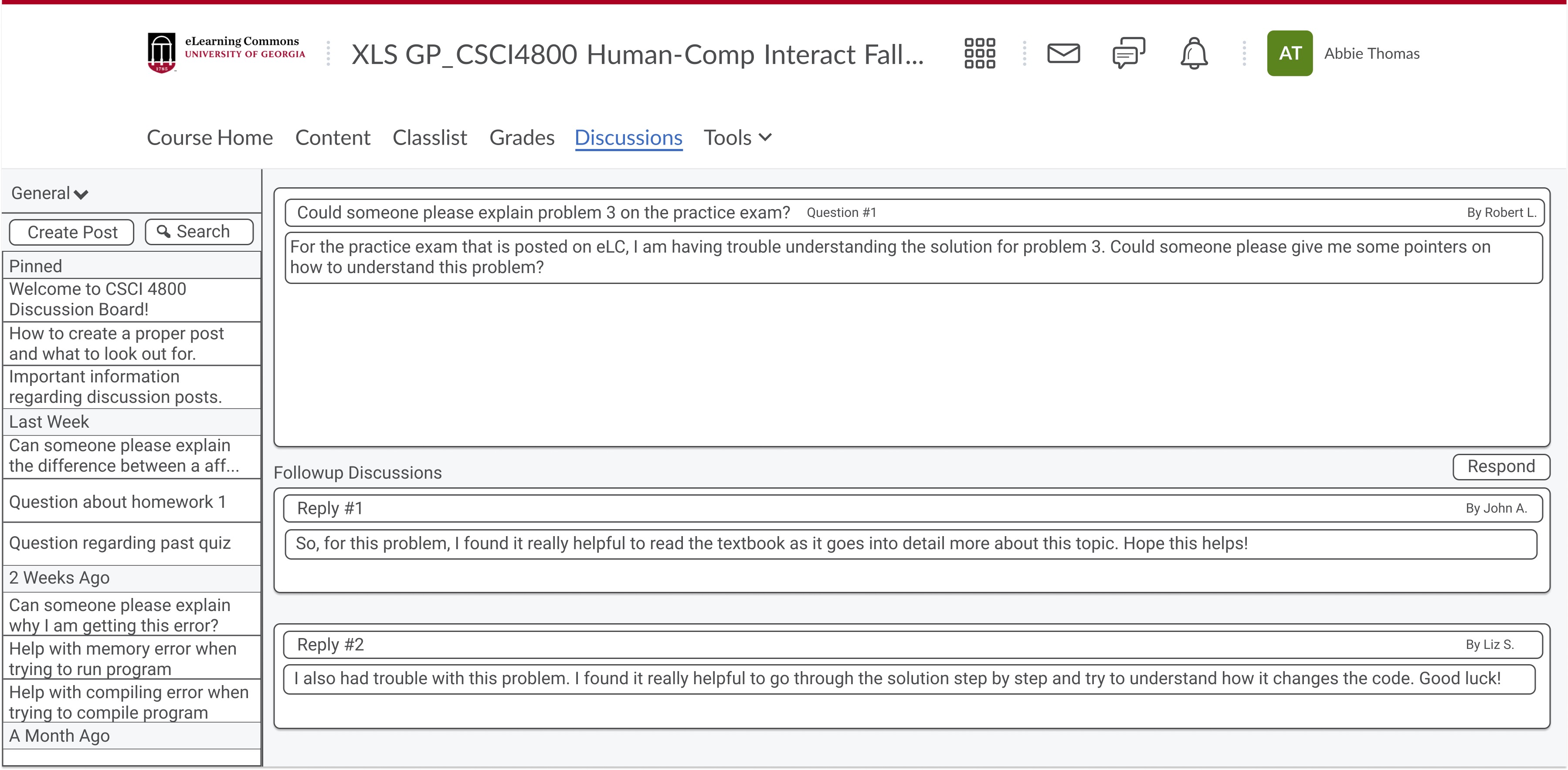
Threaded forum layout: A threadlike discussion board that allows students to make a post, and then other students can follow up on the discussion post by replying to the discussion thread.
Why is this the best design / why design decisions were made?
- Design-wise, the original post would be featured at the top and then the discussion responses below it. This design allows students to easily find original posts, read replies on the same page, and join the discussion by clicking the respond button below the original post. The design here also includes the name of the author of the post so that users know who posted a discussion post and who replied. We went with the threadlike discussion board design because it improves how the class communicates and interacts with the class content. (Making good..., 2021)
Dump Bucket Layout
Threaded Forum Layout
High-Fidelity Mockup
i. Navigate between posts on the general page
ii. Navigate to other pages (Projects, Chapter 1)
iii. Search Bar
3. Ask Questions
User Story
User Type: Student
As a student, I would like to ask questions to the entire class for anyone to respond so I can receive a wide variety of responses.
Relevance to Project:
Students that ask public questions, would like to ask questions similar to raising your hand in class. This can extend to outside of the classroom outside the class time even for face to face settings to keep the learning in and out of the classroom.
Ideation
| Ask Questions | |||
| Send a mass email to all of the students and wait for response emails to pour in | Ask a question during class and see if anyone would be able to respond at the time (Live chat) | A thread / forum like interface that the entire class can see and answer at any time - allowing all students an opportunity at any time to ask questions | Ask your instructor over email, before class, after class and see if they would be able to give you a response to a question |
Low-Fidelity Wireframe
Creating a post in the forum for questions: Discussion feed with follow-up discussion posts: A discussion feed with follow-up questions allows students to post their questions/comments about a topic for the entire class to view and respond to. Students can form a group and reply to the discussion post as a group. The responses to the original discussion post are listed below the original discussion post so that students and instructors can easily reference the original discussion post and new posts.
Why is this the best design? / Why were design choices made?
- Design-wise, this style of Q&A discussion allows students to quickly find the original discussion questions and then look at the posts posted by their peers and join the discussion. This type of design facilitates learning because students can learn from other students' posts and gain a new perspective on the class content.
Live chat for questions: Live Question discussion forum so students can submit their questions during lecture, and the instructor can reference the live question feed and answer student questions as they post them.
Why is this the best design? / Why were design choices made?
- Having a live question feed would facilitate in-class discussions because the instructor can easily look at the questions as they are posted - and it minimizes yelling across a large classroom to ask a question. It also allows students who don't feel comfortable talking in class to get their questions answered because they can type it out and submit their questions to the live question discussion forum. The user interface is designed with a simple design with a text area for students to write their questions and then the live feed where students and instructors can view the questions submitted. This design also helps when dealing with a large lecture class filled with 100+ students. In larger classes, it can be difficult for the instructor to see if a student is raising their hand to ask a question, but with this live question discussion forum, the instructor can just reference the feed vs. searching around the room to see who is raising their hand, thus optimizing the learning flow. (Ferlazzo, 2021)
Creating a post in the forum for questions
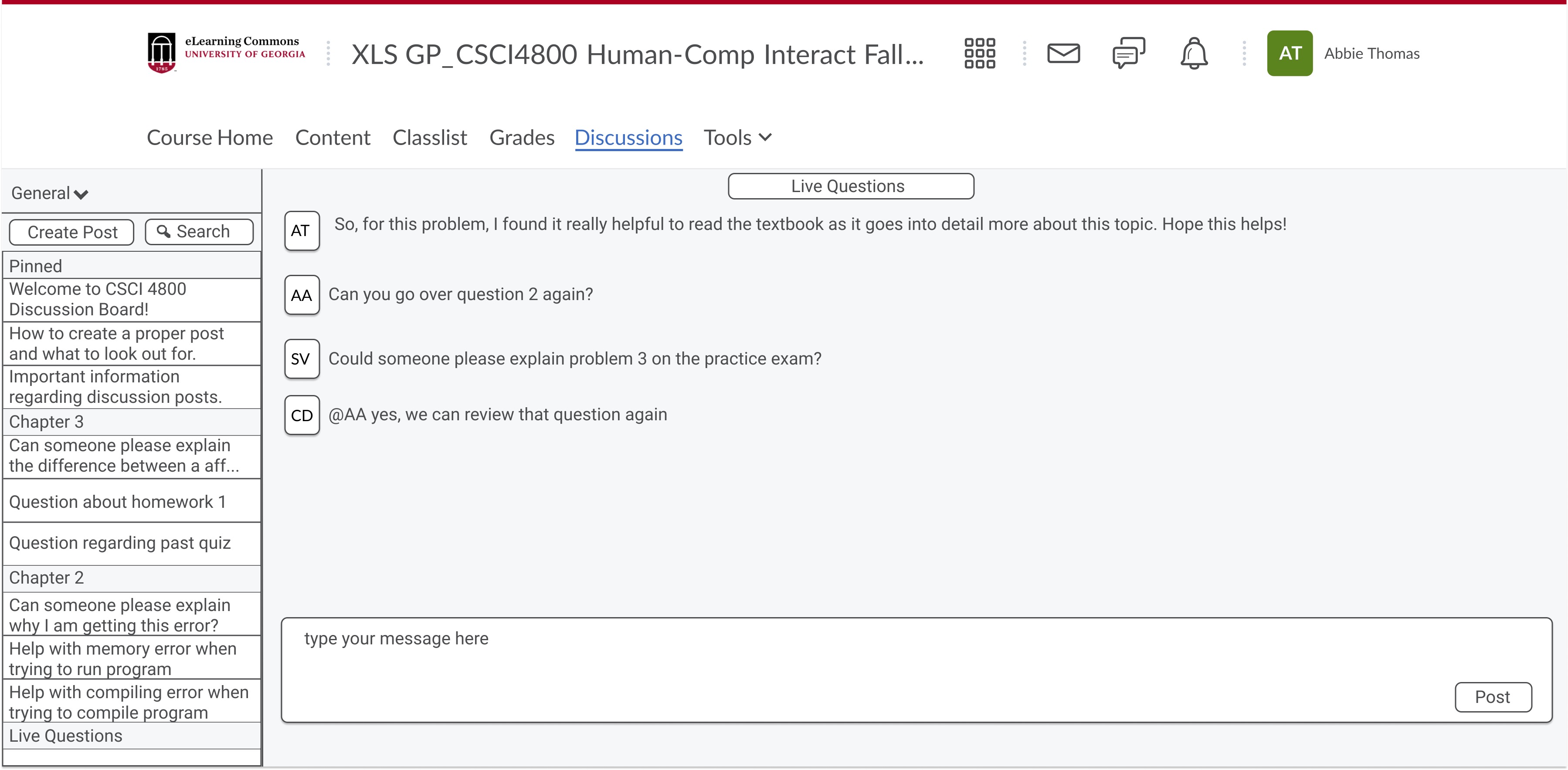
Live chat for asking questions
High-Fidelity Mockup
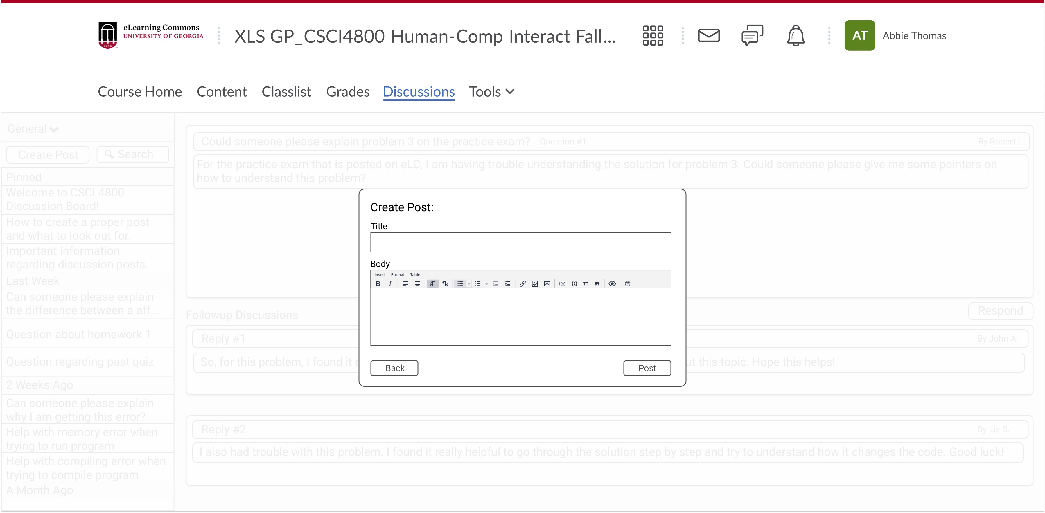
i. Click "Create Post"
ii. Click Title Box to add title
iii. Click Body Box to add body
iv. Click Post to post question
v. Click Back anytime to cancel
4. View Previous Discussion
User Story
User Type: Student or Instructor
As a user of the system, I would like to be able to view and search previous discussion topics easily, in retrospect to view previous posts.
Relevance to Project:
Users would like to be able to search and view discussions in retrospect to review and deepen their understanding on a course topic or subject. Similar to an instructor writing on the board and students taking notes to review later. Instructors may use this to see the type of questions that were asked on Piazza to influence and broaden their approach to delivering information for subsequent classes.
Ideation
| View Previous Discussions | ||||
| Organize posts by date. Option to organize by oldest or newest | Record previous in class discussions with permission and view the recordings at another time | Instructors post the discussion video / materials on ELC in an effort to allow for viewing of previous discussions at any time | Implement a search bar to find previous topics | Organize the discussion board by topic (general, exams, projects, readings, etc) |
Low-Fidelity Wireframe
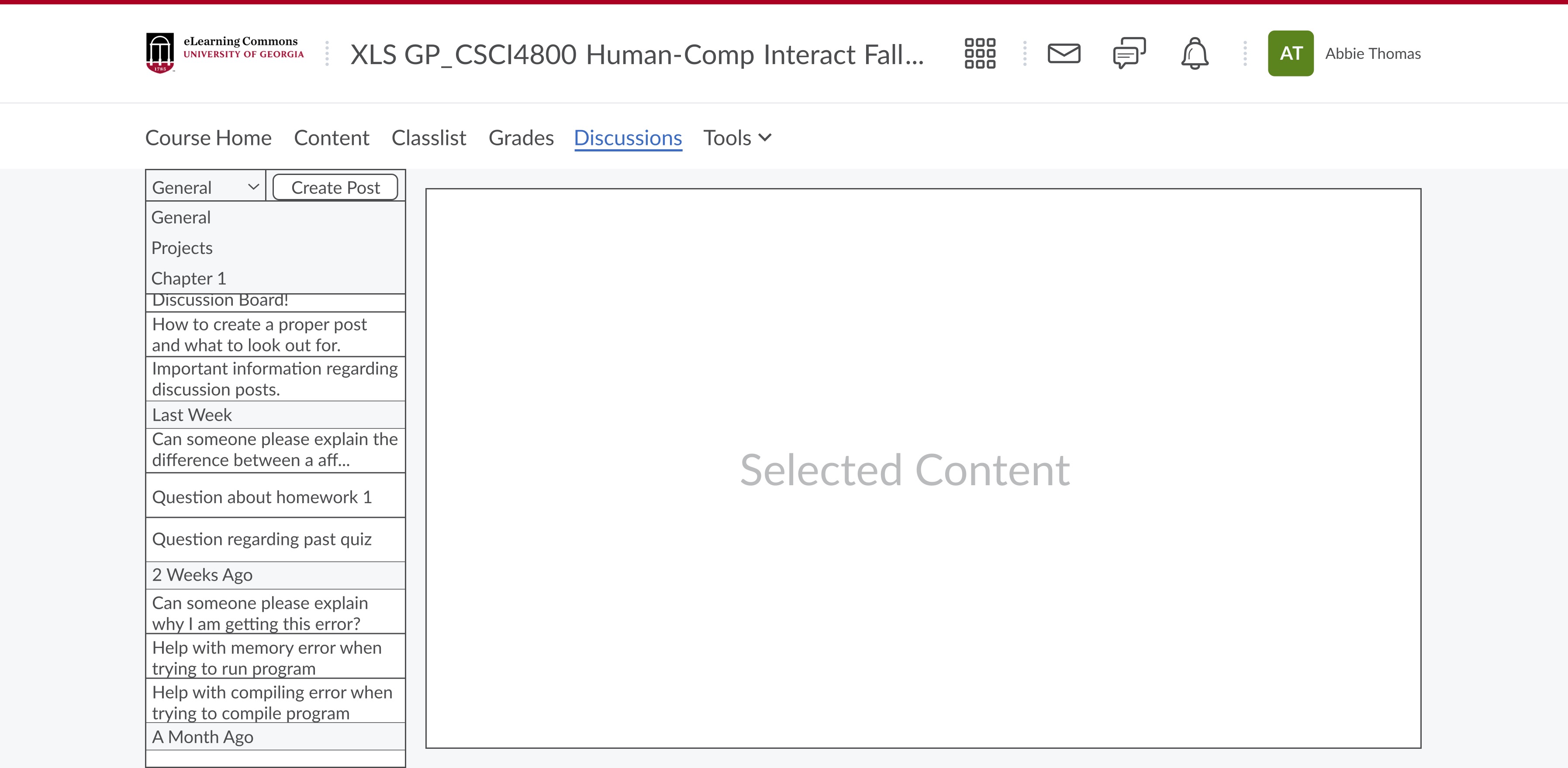
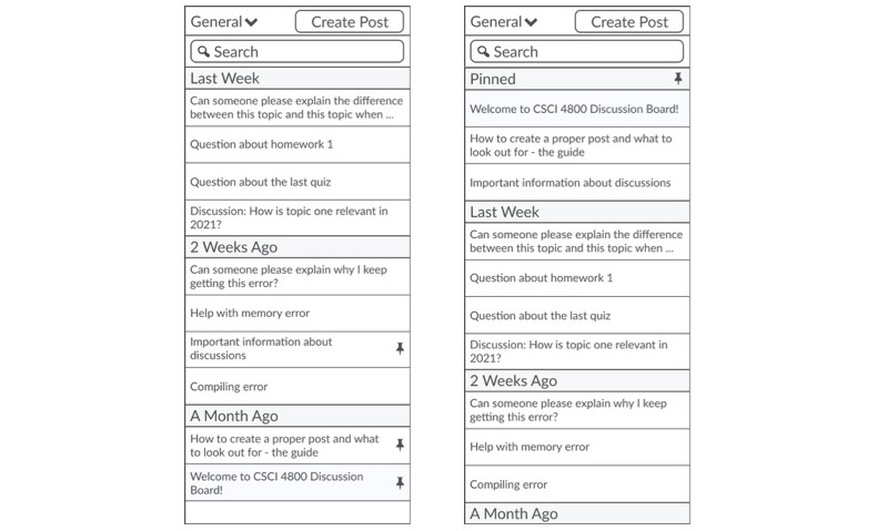
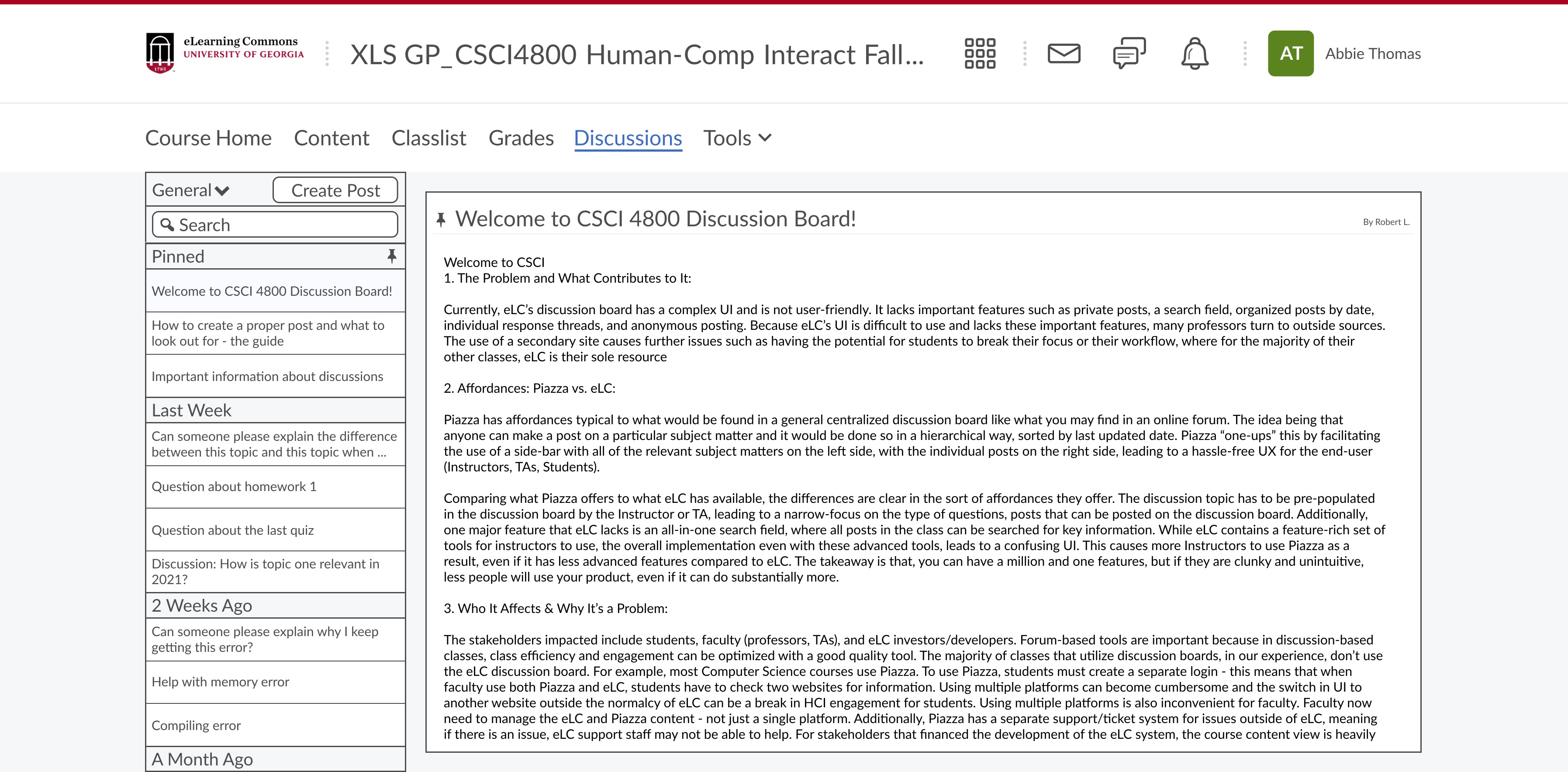
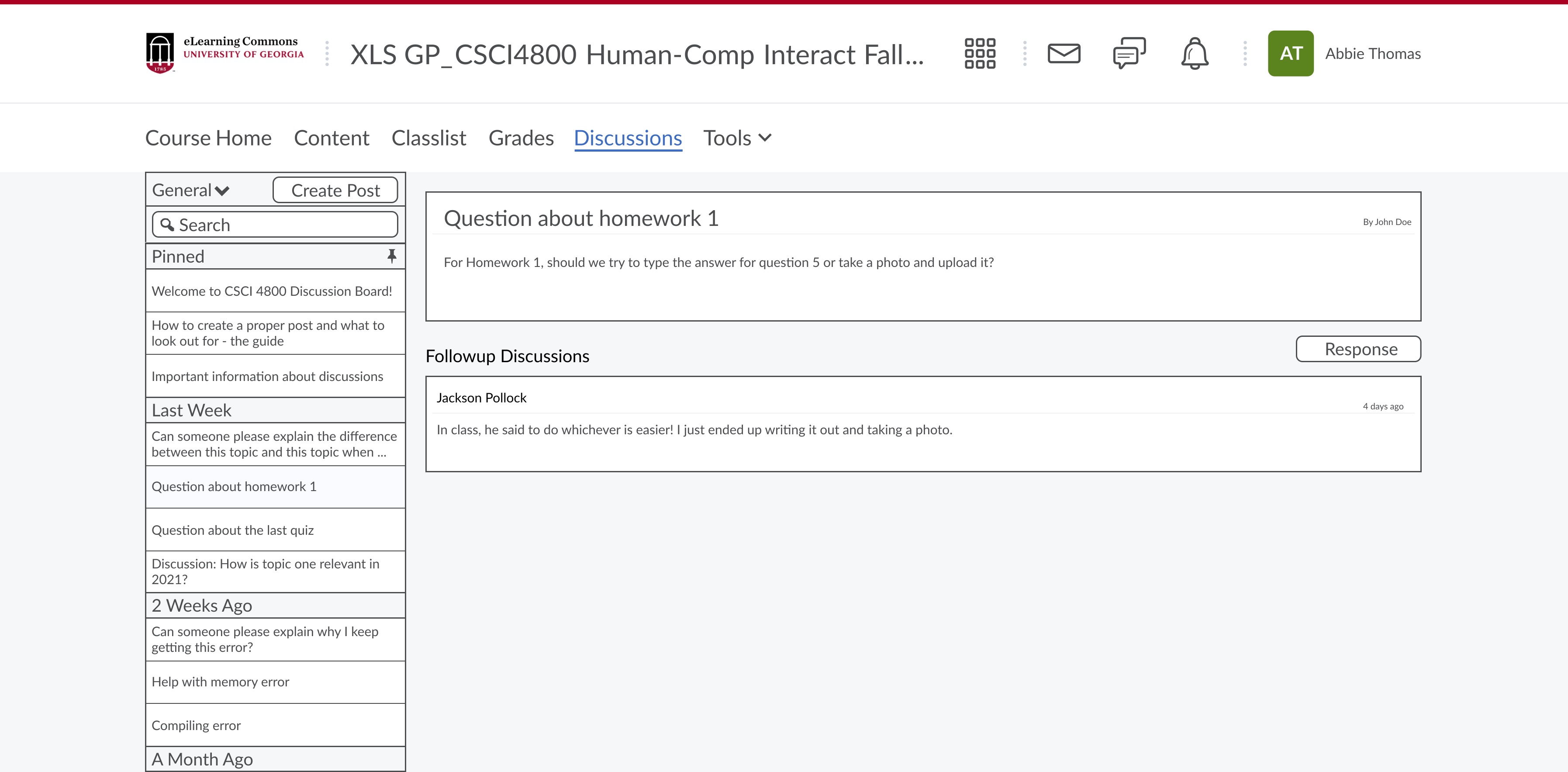
Search Bar: A discussion forum that allows students to view previous discussion posts. This allows the instructor to group discussion topics, and then students can reference the discussion post and responses later on. Students can access discussion posts using the sidebar, and important posts can be marked with a "pin." The pinned discussion posts will be moved to the pinned section so that students can reference information quickly in one location. (Insider..., 2021)
Why is this the best design? / Why were design choices made?
- This is the best design because then students' responses to the discussions are not lost. The discussion responses are saved so students can reference the discussions later to review the class material. This is an intuitive design, and it is similar to other discussion forums where there is a sidebar that houses past discussion questions. When the user clicks on a particular discussion question, the discussion post opens, and the user can view the original discussion post and the responses.
Organize discussion board by topic: A discussion forum that allows users to easily filter posts by topic so that they can access the information they are looking for quickly
Why is this the best design? / Why were design choices made?
- Having a filter allows students to reduce the number of posts shown and focus on the post content that they need to look at.
- Students can organize the posts from oldest to newest or newest to oldest to get the latest information at the top of their feed.
- Students often need to find specific information in discussion forums, so with this design, they would be able to do a keyword or key phrase search to search through all of the discussion posts. After typing in the keyword or phrase and hitting search in the search bar, the result would filter and only display posts with those keywords.
- Design-wise, we considered other options to organize content such as just grouping posts by topic and not having a filter system - but we felt like having a filter system was the best design because then each student can filter the discussion forum to find specific information that they are looking for.
Search Bar Location
Search Bar Implemented
Organize discussion board by topic in drop down menu
High-Fidelity Mockup
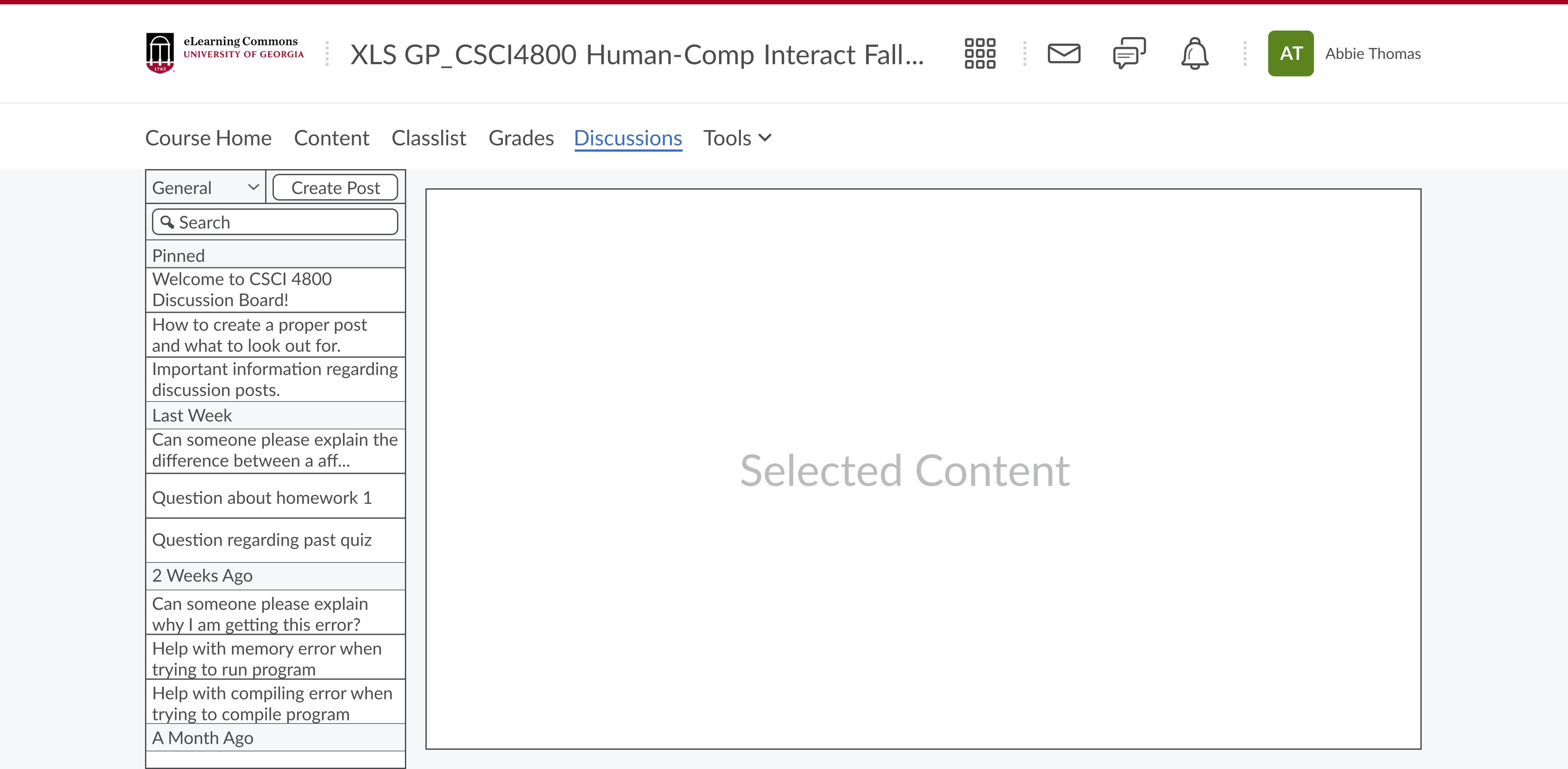
i. Click General menu
ii. Use menu to navigate between Projects, Chapter 1, or General pages
iii. Click Search bar to see sample search of "1".
iv. Click search bar again to exit search
5. Pin Key Threads
User Story
User Type: Instructor
As an instructor, I would like to pin important threads to the top for key notes for students to inform of important topics or posts.
Relevance to Project:
Instructors would like to be able to pin key threads similar to sticky notes or headlines in class to keep in mind. This is similar to the ELC reminders or pins that an instructor may opt to pin to the course for students to see.
Ideation
| Pin Key Threads | |||
| Forum / Thread Like System - where key threads can be pinned to the top using a simple interface - ie. clicking the pin icon at the admin level inside the thread | Group chat like system - where key comments can be pinned for later viewing within the individual server / channel | A pin icon near each thread that can be clicked by the instructor to pin to the top is displayed next to original post, but not moved | Automatically make all instructor posts pinned posts unless opted out of when creating the post |
Low-Fidelity Wireframe
Pins moved to top: Forum / Threadlike System - where key threads can be pinned to the top using a simple interface - ie. Clicking the pin icon as an admin level inside the thread to pin them to the top.
Why is this the best design? / Why were design choices made?
- Similar to other discussion boards on the internet, pinned threads or “stickies” are pinned to the top given their sheer importance to users of the system.
- These pinned threads often contain crucial information and in a course setting, can be elements to a students success to bear in mind. Example - exams coming up, projects due, FAQs, assignments due, and general course information can be pinned here.
- Our design methodology is to use the tried and true method of clicking a “pin” icon to pin the threads with a designator symbol to signify that this thread is pinned to the top by the instructor / TA and should be looked at.
- The choice to go with a simple interface is to make the user experience for instructors as seamless as possible to allow them to focus on getting the work completed and conveying necessary information in a timely manner, rather than fiddle with the system to find the ability to pin these specific threads.
- While other designs could be used such as a checkbox to “place on top of board”, this would create unnecessary complexity to the system which is not coherent with the underlying focus on this UI to be simple, effective to use, with key signifers in place that bring a familiar feel to using the system.
Pins kept in place: Clicking will mark a signifer for importance to the post - ie “Oh a pin by the instructor, we should read this”.
Why is this the best design? / Why were design choices made?
- Simiiar to the previous, the difference is that this would not pin the threads to the top, rather the pins acts as a sort of signifier to the student to view this post with a higher level of importance.
- The idea for this was inspired by a sort of alert icon or a importance icon that can be attached to a post to notify the user that this post is regarded with higher importance.
- The reason they are not pinned to the top is to keep the threads in a consistent order for when they were created.
Pins kept in place or moved to top
Pinned Message

Unpinned Message
Unpinned Message Student View
High-Fidelity Mockup
i. Click between pinned note "Welcome to CSCI 4800 Discussion Board" and unpinned note "Questions about Homework 1"
ii. Pin note "Questions about Homework 1" by clicking pin
iii. Unpin note "Questions about Homework 1" by clicking pin again
6. Facilitate Discussion
User Story
User Type: Instructor
As an instructor, I would like for all my students to be able to contribute to a discussion to facilitate class participation and hear from all students in the course.
Relevance to Project:
Instructors have the goal for classroom learning to be deep and meaningful for all students To facilitate discussion, instructors may want all students to contribute to the discussion to keep the conversation going and among all students.
Ideation
| Facilitate Discussion | |||
| Allow students to raise their hand and allow as many students as possible to contribute | Threaded Forum interface - students / groups can work to discuss among themselves and extend to discuss as a class | Private group chat like interface - where students / groups can work in a private group channel and contribute their answers to the public channel | Interface like a dump bucket where all students can drop in and the most common ideas get larger and larger among them all |
Low-Fidelity Wireframe
Dump Bucket Layout: Students / Groups can spitball ideas to a whiteboard style interface to generate discussion. Similar to the numerous ideas DDQ we did in class.
Why is this the best design? / Why were design choices made?
- While the Piazza interface is one approach to facilitating discussion, this is an alternate way to allow students to spitball their commentary on an in class topic.
- This can further be leveraged if the system is further developed to support some ideas growing in size on the board if they are similar to other submitted ideas.
- The design choice for this was selected in the numerous ideas as an alternate out of box ideas to approaching this project problem of how to generate more in class discussion.
- Rather than having students yell out or wait to be called on, this allows all students to put in an effort to drive the discussion. (Online..., 2021)
Threaded Forum Layout: Students / Groups can work to discuss among themselves and extend the discussion as a class once done.
Why is this the best design? / Why were design choices made?
- Piazza is an example of a system that helps facilitate discussion well with its format being similar to an online discussion board. Thread topics can be made by students / instructors for which students / instructors can comment on and reply to specific responses and keep the discussion going.
- This is inherently the best design due to how well it works in keeping content placed in a relevant space.
- Inherently, when content is not placed in a coherent fashion, it may appear to be cluttered and as a result, can deter a user from using the system due to cognative overload, or attention that is all over the place.
- The design choice to opt for a Piazza like system allows for content to be placed strategically and coherently, in a method that just makes sense to use and follow through with.
- Students can contribute their own responses / Groups can respond collectively with other groups tagging into provide feedback or further the discussion.
- With larger in person classes, this can be a challange to hear out every student and what they have to say. This system is allowing for more students to voice their stance and using a system like Piazza that is tried and true, and gets the fundamentals right is key to ensuring a good user experience.
- The goal - have students focus on the the content, not the distractions. (Lorna..., 2019)
Overall goal of this user story is the same as user story 2. Refer to wireframes in section 2:
Figma Link (Facilitate Discussion)
Dump Bucket Layout
Threaded Forum Layout
High-Fidelity Mockup
See Mockup for 2. Class Discussion
7. Answer Questions
User Story
User Type: Instructor
As an instructor, I would like to answer student questions and have public answers available for anyone to see to be able to answer repeated questions less.
Relevance to Project:
Instructors often receive the same questions repeatedly and often answer with the same exact response. To reduce the same questions from being asked, being able to answer questions with a special “instructor” marking will let all students in the system see the response.
Ideation
| Answer Questions | |||
| For common questions, answer them in an FAQ section on ELC that is pinned for all students to see | On Thread / Forum based system - public questions that are posted can be answered | Leveraging a Discord / Slack like interface - allow a reply to a question to be auto-pinned into a questions channel / thread that is labeled by the question topic ie. General / Subject X / Subject Y / etc | Allow students to fill out a question box whose replies are automatically pinned to a questions pane / page with the question and associated response |
Low-Fidelity Wireframe
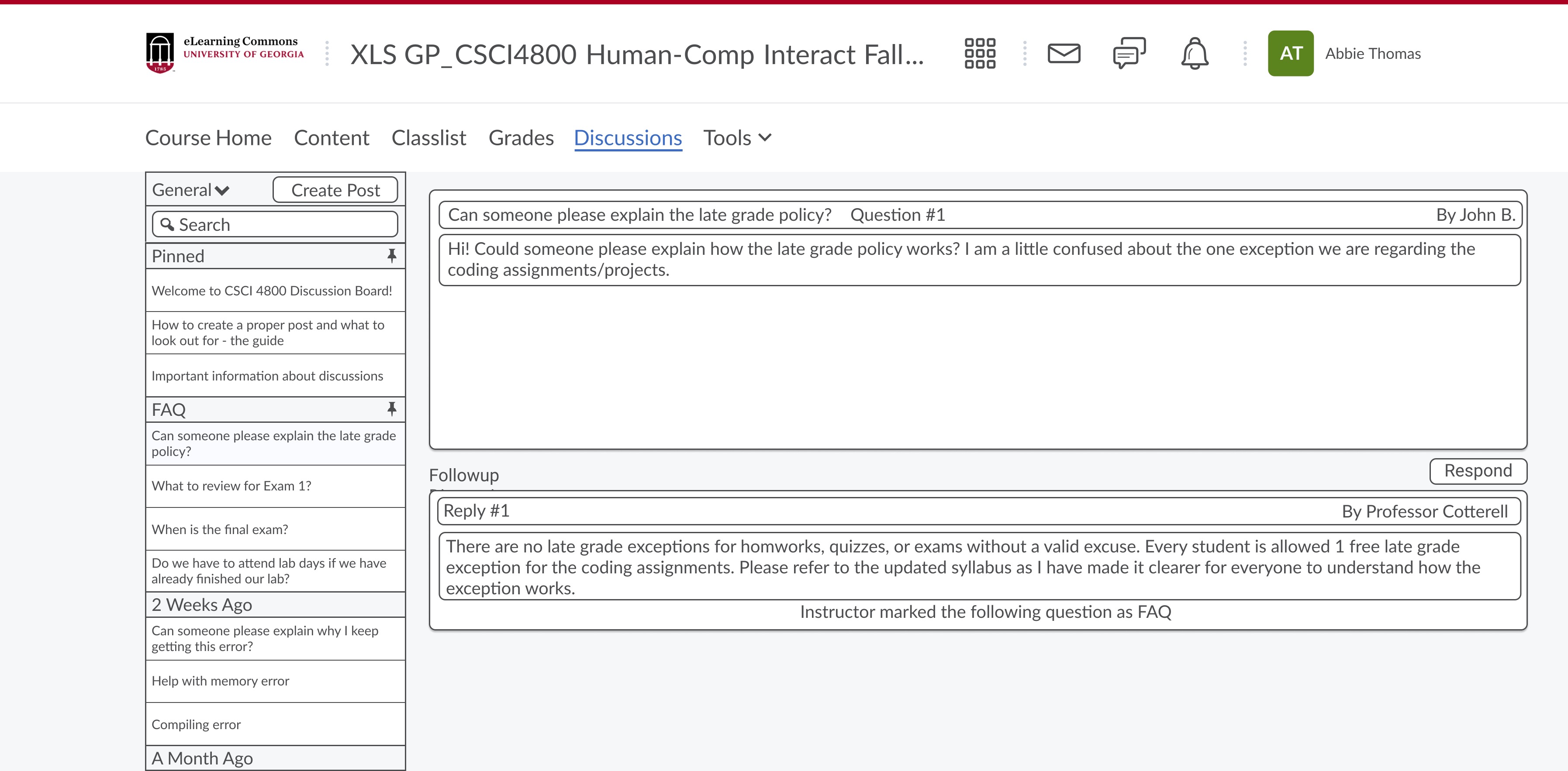
Pinned Frequently Asked Questions (FAQ) Section: Public questions that are asked would be pinned to ELC which can be found in a specific location that can be found by students for commonly asked questions. Currently, ELC has a bulletin system for each course where instructors can post stickies to keep in mind.
Why is this the best design? / Why were design choices made?
- Ensuring the system is clean with thoughtful design taken into account on how to handle commonly asked questions, which is a prominent activity that takes place in courses.
- Similar to labeling responses with a “tag” on certain note-taking applications, this would allow for FAQs to be posted in one central location that students can view.
- Our design methodology would entail for these questions asked with this system to be automatically pinned to the FAQ section when answered in a public setting. This would allow for students to search through this section to found the information they may be seeking, prior to asking the same question again. This would keep the system feed clean and lower the possibility of redundant questions being asked.
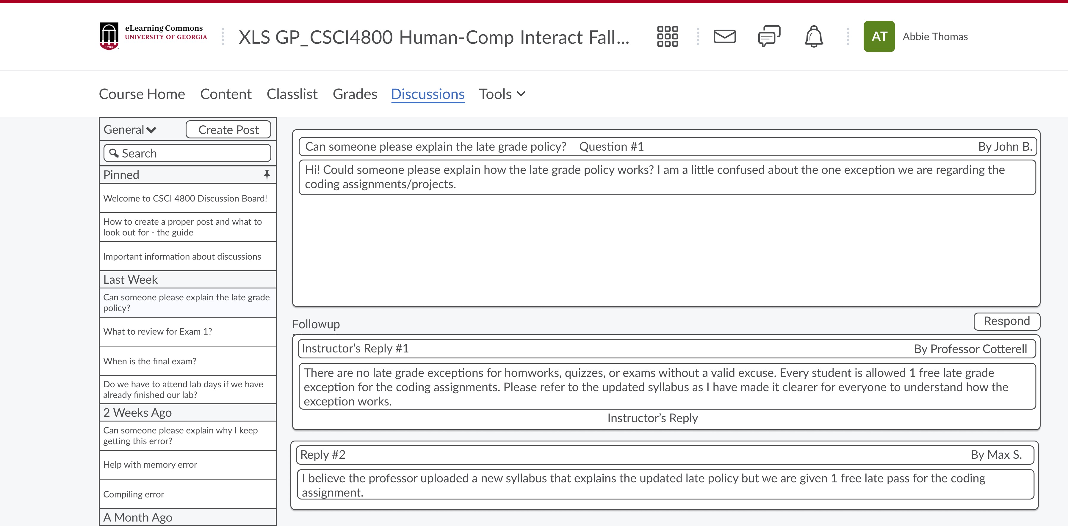
Answer questions through threads: Public questions asked would be answered and handled in a manner like on Piazza. Similar to student responses, instructor responses would be a one-up in the sense that they would have an instructor designator next to the response to indicate this came from an instructor.
Why is this the best design? / Why were design choices made?
- Similar to a common style internet forum, moderators would have a “mod”, or administrators would have an “admin” tag near the response to indicate a special type of user responded to the question that was being asked.
- Instructors are often asked the same questions by different students, and offering the ability to ask public questions with this system, will allow for the instructor to reply one time to the question and simply link the response to a duplicate question and inform the user that this question was asked previously and to check the response curated.
- Inherently, these forums are in a public domain that can be viewed by anyone and the design implementation is similar in nature to what goes on with this style of discussion board.
Pinned Frequently Asked Questions (FAQ) Section
Answer Questions through threads
High-Fidelity Mockup
i. Click "Respond"
ii. Click box "Respond Individually"
iii. Click "Respond" to write response or "Cancel" to Cancel
iv. Click "Back" to go back without posting or "Post" to post response
8. Endorse Responses
User Story
User Type: Instructor
As an instructor, I would like to endorse student responses for all students to see to highlight great responses that are on point.
Relevance to Project:
In this open setting, students and instructors all contribute to what is posted. Students may answer student questions and instructors being able to endorse responses will let other students know that a particular response is endorsed by them.
Ideation
| Endorse Responses | |||
| Mark a “Endorsed” label to specific replies that are made in the discussion that is going on / or the question that was asked | For a chat like interface - leverage a system where instructors can dump replies into a endorsed responses server / thread | Move answers with most endorsements to the top (giving priority to instructor endorsements) | ‘Liking’ system where users can see the number of likes for a response |
Low-Fidelity Wireframe
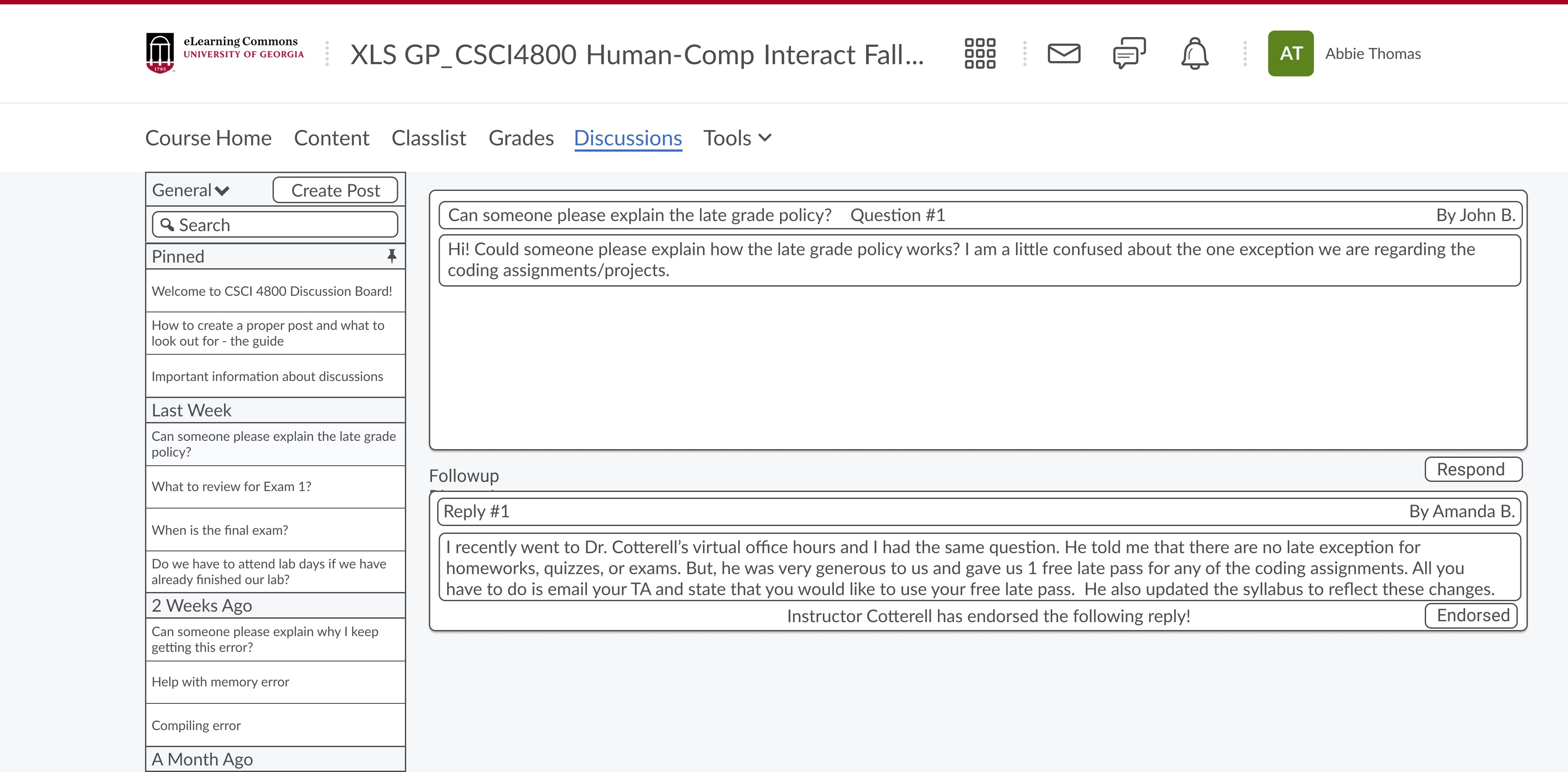
Answers Endorsed by Professor: With courses being led by instructors, having specific answers that are marked as “Endorsed by Professor X”, will provide students with the confidence that a specific answer was endorsed and chosen by the instructor of the course.
Why this is the best design / why design decisions were made?
- <
li>Particularly near the answer / response, there would be a label when an instructor endorses a response - similar to the system that is utilized with Piazza currently.
- It is implied that the instructor responses would hold much more weight and an endorsement would hold the same weight, similar to an instructors actual response.
- The design here would be to inform the user that the instructor has viewed and understood the response and has given the seal of approval on this answer being an answer that the instructor would also say if asked the same question or topic.
Liking System: A liking system can be leveraged within the design to allow students to like responses with a ticker to show specific answers hold community following and have some weight as a result - or may have found a particular response to be profound or helpful.
Why this is the best design / why design decisions were made?
- This can be akin to a system like social media where certain responses may be highly regarded by the community.
- Inherently, these design choices would allow for more granular information to be presented to viewers of the system.
- In general, instead of cluttering the system with responses like “I like this”, or “This is great”, which would provide for a cluttered feed, this method would allow for this same method of information to be relayed, without the feed being cluttered with the same responses again and again. This method would allow for the actual responses to be focused on that can curate further discussion, further understanding, and keep topics relevant and not go astray. (View of..., 2021)
Responses Endorsed by Professor
Responses moved to top based on number of likes
High-Fidelity Mockup
i. Click "Endorse" on Jackson Pollock's answer to endorse it
ii. Click "Endorsed!" to unendorse the answer
iii. Hover over "Hover for Student View" to see student view at any time
Design Justifications
Discussion Board
- Building upon the wireframe from the earlier sub-deliverable, part B, the idea here was to build an evolution over the current system being used by ELC. The focus? - Simple, clean, with an interface that clearly defines aspects of affordances and signifiers.
- The intent was to design a piazza-esque style discussion board that is integrated with the ELC System.
- Affordances and Signifiers:
- Side Pane (Left Side):
- Affordances: There is a simple thread list with a create post button, a drop-down for topic style (general, group, etc.), and a unified search bar to search threads. This affords the user the ability to search and create threads from the sidebar similar to other discussion boards and leverages a unified interface rather than the split-page style ELC uses now. The intent is to remove unnecessary steps for using the system.
- Signifiers: The signifier for the pin threads is represented with a “pin” logo to show these are where the pinned threads would be located. The search bar is a traditional look to signify that a user can search threads here to filter specific keywords, topics, similar to how Piazza does it now. The intent here is to allow for a seamless search, removing unnecessary steps (i.e. querying a search and waiting for results on a separate page).
- Main Pane (Right Side):
- Affordances: POV is to be from an administrator's perspective to show additional features that a student user would not see. This main pane has inputs to pin threads and respond to threads. The intent here is to keep a simple and content-focused approach with the main affordances of viewing the thread material, pinning the thread (for capable users), and responding to the thread itself.
- Signifiers: The empty pin is to signify that this is NOT a pinned thread and a shaded pin icon would signify that this is a pinned thread. Additionally, specific keywords in areas are used to break up the display of information to signify the relevant thread information - ie. if you are looking for the follow-up discussions to the thread, read under the “Followup Discussions” header. Additional signifiers are used such as the “read more” in blue to show more of the individual responses. Each response is condensed showing some information to keep the interface clutter-free.
- Additional Justifications for Design:
- The color palette used is to be integrated into the ELC system to keep a consistent and familiar look. The intention is to not present a jarring interface design that deters from the ELC - causing a distraction to the user using the system.
- Similar to the course pages in ELC, the intent is to feel familiar to use while affording the user the power to have a discussion board to broaden their learning within a course setting.
- Notice the “Discussions” highlighted in the tab-pane. The intent is to jump the user right into the interface upon clicking. The current ELC system has multiple pages separating the threads and the responses.
- Sources:
- https://uxdesign.cc/familiarity-in-design-70df1979f80
- https://careerfoundry.com/en/blog/ui-design/the-importance-of-consistency-in-ui-design/
- https://uxdesign.cc/less-is-more-ui-design-vs-cognitive-bandwidth-f368130d7a6e
Group Response
- The consistency with keeping the interface simple, but effective carries over here. This interface consists of members within the response group with the thread excerpt on top - similar to a prompt. The interface deploys the use of a rich text editor as a powerful collaboration tool to link rich media, text, and format a response as the user may need to.
- Notice, between the discussion board and the group response, the interface in the middle is the same, keeping that feeling of consistency throughout the UI.
- Affordances and Signifiers:
- Left Side:
- Affordances: The left pane has similar inputs such as post, save, and back. These afford the user basic inputs to go back a page, to post their response, or save their progress and return at another time should they need to. This builds upon this idea of being a focused UI to get discussions and work done and limit distractions to using the system.
- Signifiers: The group members for this response are listed on the side, separated by color to show individual users in the group.
- Main Pane:
- Affordances: The main pain has a traditional rich text input box affording the user the power to format their responses as they need to, with font styles, text options, attaching media, links, and anything they may need to articulate their response as they need to. The sole affordance in this pane is to allow the user to focus on work. This is similar to a Google Doc, but with the hybrid twist of how Piazza functions. Additionally, the intent is for this to be a live feed pane where all collaborators are working in real-time, similar to Google Docs and Piazza.
- Signifiers: There are basic signifiers such as a shaded button to notify the user that a particular rich text edit feature is selected (Bold / Italic / Bullets, etc.).
- Right Pane:
- Affordances: Tucked away in the corner of this page is a message/chat logo. This affords the user to collaborate with their team over text should they need to. What would be the intention for this? In larger sections with 200+ students, the rooms may be hard to manage, or groups may be separated over long distances in the classroom, leading to collaboration difficulties. This would afford the user flexibility in how this system can be used for collaboration.
- Signifiers: The sole signifier on this pane is the message/chat logo that is often seen on modern websites to chat with support, for example, or in Google Docs, where the chat feed can also be shown.
Message / Message Sent
- With these mockups being a smaller design compared to the rest, these will be shown together to demonstrate and justify their design choices. The intent here was simple. A basic chat interface with a small basic text box and a send button. This would allow the team members to use the chat feature should they need to use it with the sole purpose of chatting. No additional features would be needed here as this is just a means of conversing information back and forth.
- Affordances and Signifiers:
- Affordances: This chat box affords the user with a type input box and a send button. Keeping the consistency with a simple interface, we opted for this approach to keep the chatting simple and remove distractions that can inhibit the system use.
- Signifiers: Each group member is shown next to their response to show the user who is responding and chatting via the chat system. Additionally, there is a distinct faded line between responses to signify the difference between responses in the chat system.
- Similar to messages/messages sent, these would be reviewed together.
- Affordances and Signifiers:
- Affordances: The interface for this has the intent to be basic and provide the necessary affordances for the user to invite users, respond individually by selecting the checkbox to block the use of inviting users.
- Signifiers: Each invited member is shown underneath the input box to show they would be invited with the response button when clicked. The “X” in the Respond Individually box would fade the invite box, preventing users from being invited to the response window.
- The overarching intent here was to pick from the numerous ideas and compile components that would make for a simple, well integrated system that focused on getting the discussion going while limiting distractions.
- Unlike Piazza and the current ELC system, the simplified approach is more inviting and inherently more intuitive to use as a result due to there not being a cognitive overload on seeing a sheer large number of buttons, inputs, or information boxes similar to how Piazza is currently.
- The end-goal with this approach is to approach the user stories with the key affordances and signifiers that would allow the user to utilize the capability of the system within the interface, without there being a need to second guess using the system and its numerous features.
Summary Video
Download .fig Source File
Sources
Low Fidelity Sources:
- Attfield, B. (n.d.). Pros and cons of instant messaging in the Workplace. Jostle Blog. Retrieved November 7, 2021, from https://blog.jostle.me/blog/pros-cons-instant-messaging-workplace.
- Ferlazzo, L. (2021, March 5). Effective strategies for using online student-discussion boards (opinion). Education Week. Retrieved November 7, 2021, from https://www.edweek.org/teaching-learning/opinion-effective-strategies-for-using-online-student-discussion-boards/2020/10#:~:text=Even%20if%20you%20are%20in,use%20correct%20grammar%20and%20mechanics.
- Inside higher ed. New approaches to discussion boards aim for dynamic online learning experiences. (n.d.). Retrieved November 7, 2021, from https://www.insidehighered.com/digital-learning/article/2019/03/27/new-approaches-discussion-boards-aim-dynamic-online-learning.
- Leah. “11 Unique Benefits of Live Chat in Education.” Userlike Live Chat, Userlike, 21 June 2019, https://www.userlike.com/en/blog/live-chat-education.
- Lorna CrowleyChief Marketing OfficerLorna Crowley is an experienced Chief Marketing Officer with a track record of delivering impressive results. Her passion for marketing can be traced back to her university days, Blake-Thomas, P. by: C., & Gleason, P. by: D. (2019, October 7). Simple web design: The science behind why uncluttered websites work: EyeQuant – Data Driven Design. EyeQuant. Retrieved November 7, 2021, from https://www.eyequant.com/resources/simple-web-design-the-science-behind-why-uncluttered-websites-work/.
- Making good use of online discussion boards. The K. Patricia Cross Academy. (2020, June 25). Retrieved November 7, 2021, from https://kpcrossacademy.org/making-good-use-of-online-discussion-boards/.
- Online sticky notes for virtual collaboration: Miro. https://miro.com/. (n.d.). Retrieved November 7, 2021, from https://miro.com/online-sticky-notes/. View of the social significance of the Facebook like button: First Monday. View of The social significance of the Facebook Like button | First Monday. (n.d.). Retrieved November 7, 2021, from https://firstmonday.org/ojs/index.php/fm/article/view/5505/4581.
- Sticky-note brainstorming: Education world. Sticky-Note Brainstorming | Education World. (n.d.). Retrieved November 7, 2021, from https://www.educationworld.com/a_admin/meetingidea/meetingideas009.shtml.
- View of the social significance of the Facebook like button: First Monday. View of The social significance of the Facebook Like button | First Monday. (n.d.). Retrieved November 7, 2021, from https://firstmonday.org/ojs/index.php/fm/article/view/5505/4581.
- Why Modern Products Need Collaborative text editing. Blueprint - Blog by Tiny. (n.d.). Retrieved November 7, 2021, from https://www.tiny.cloud/blog/collaborative-text-editing/.
High Fidelity Sources:
- Ghaith, A. (2019, October 22). Less is more: Ui Design vs cognitive bandwidth. Medium. Retrieved November 7, 2021, from https://uxdesign.cc/less-is-more-ui-design-vs-cognitive-bandwidth-f368130d7a6e.
- Payyanur, G. (2019, August 15). Using the power of familiarity in Design. Medium. Retrieved November 7, 2021, from https://uxdesign.cc/familiarity-in-design-70df1979f80.
- Riva, M. D. L. (2021, September 6). Why consistency is so incredibly important in Ui Design. CareerFoundry. Retrieved November 7, 2021, from https://careerfoundry.com/en/blog/ui-design/the-importance-of-consistency-in-ui-design/.